McDonalds is a long established company, it was founded in 1940. It is a huge company, and in a world where society that is becoming an increasingly globalised, it has provided millions of people with jobs worldwide, and currently employs over 400,000 people worldwide. In 2013, McDonalds profit was over $5.5bn. You might say that McDonalds is the living embodiment of the multinational corporation in modern day society. The companies longevity and success runs alongside the continuity of the image and branding of the company, which has been maintained through it's advertising and design.
One of the biggest issues I have on a personal level with the First Things First Manifesto (1964) is the third paragraph.
"By far the greatest effort of those working in the advertising industry are wasted in the trivial purposes, which contribute little or nothing to our national prosperity".
My understanding of the term prosperity is how well something is doing in terms of it's existence, and so national prosperity is about how well the country is doing. Between 2008 and 2011, the UK McDonalds company paid close to £90 million in tax, which is a huge sum of money, made all the more important given the current financial climate. If that £90m wasn't in the governments back pocket, then that's potentially £90m that couldn't be spent on things such as education, public services, and healthcare. Although admittedly McDonalds will have cost the NHS some money due to the health repercussions of their food.
I feel like the 2000 version of the Manifesto is a lot more aggressive and pushy in terms of its terminology, but at the same time I feel like the message put across in the manifesto is weaker than it was in the initial one. The use of the items "butt toners" and "heavy-duty recreational vehicles" in their list of things that designers can't touch shows a bit of lazyness on the writers' part given their use later on in the first manifesto. I feel these were used because the writers' wanted to show some sort of continuity between it and the first manifesto given the difference of tone between the two. The last sentence of the last paragraph,
"Today, we renew their manifesto in expectation that no more decades will pass before it's taken to heart."
I feel quite strongly that the word "expectation" is completely unforgivable in this context, given that they talk about priorities in the manifesto. I feel like the graphic design community, in my experience at least, is too obsessive about design. If this manifesto was about the NHS or something like that, then the word "expectation" could be completely justified in my opinion.
This sort of hypocrisy, for use of a better (or more appropriate) word is illustrated in the 7th footnote of Michael Bierut's footnotes on the manifesto, where he claims that the examples of acceptable jobs are far too vague. He says,
"things like the FDA Nutrition Facts label, probably the most useful and widely reproduced piece of graphic design of the twentieth century, generally recieve neither awards nor accolades from the likes of Adbusters or Rick Poynor: too humble, to accessible, too unshocking, too boring."
This, somewhat ironically backed up in Poynor's text as well in the first paragraph of the last page where he states
"Meanwhile in the sensation-hungry design pres... ...design really can help your business more competitive".
I agree with Bierut's claims, despite being graphic design student, I do feel like somewhat of an outsider looking in on the world of design due to how it feels to be somewhat pretentious, something which I seek to actively avoid. McDonalds is often criticised for the nutritional value (or lack of it) in it's food, and I feel that they've missed a trick in their advertising by not including things like the FDA labels. Everyone knows McDonalds is bad for you, but it's not going to stop people from eating it, so where's the harm in displaying the nutritional facts? If that was done, then maybe the company would have a more honest image, rather than the slightly deceitful one it has been given by the media because of how bad their food is.
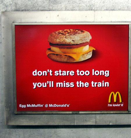
This advert for the in particular illustrates the difficulties of the manifesto in general, with particular reference to footnote 8.
"Manifestos are simple; life is complicated".
The Egg McMuffin, the particular product being advertised here, is a breakfast item. In this busy modern world, some people may not have time for breakfast. For some people, commuters especially, the Egg McMuffin might be as close to breakfast as they get, which is shown in the advert through its placement and wording. My argument against the First Things First Manifesto's claims that this is evil commercial work, would be that this piece of advertising is encouraging is encouraging people to eat breakfast, whilst at the same time, McDonalds make profit. If the manifesto is against consumerism, then surely this sort of mutually beneficial transaction is an example of good work done by a graphic designer? Not only this, but I feel that this way of thinking is only ever used by people supporting the manifesto when it suits them, note the claim in the 2000 manifesto that
"The scope of debate is shrinking".
I doubt they'd even entertain the idea of my argument.
I think that Bierut has got it spot on in the first paragraph of his 10th footnote, even if he has put it somewhat sarcastically.
"The creators of Adbusters have a dream... ...ends with mass manipulation for cultural and political ends".
I think that he references Adbusters in particular is important, as to me, that seems to be the lesser thought out manifesto, as shown by how it's signed by more well-known signatories, such as Erik Spiekermann and Ellen Lupton. I also find the exclusion of the word "students" quite notable in the second manifesto suggests that the signatories of the 2000 manifesto are comfortable with their positions within the design world. Given this sort of contrast to the more raw and emotion-packed wording and context of the 1964 manifesto (at least from my understanding from Poynor's text), and the emotional nature of Ken Garland's relationship with design (again from my understanding from Poynors text), I find it somewhat surprising that Garland endorsed the second manifesto through his signature, such is the difference between the tone of the two.
No comments:
Post a Comment